
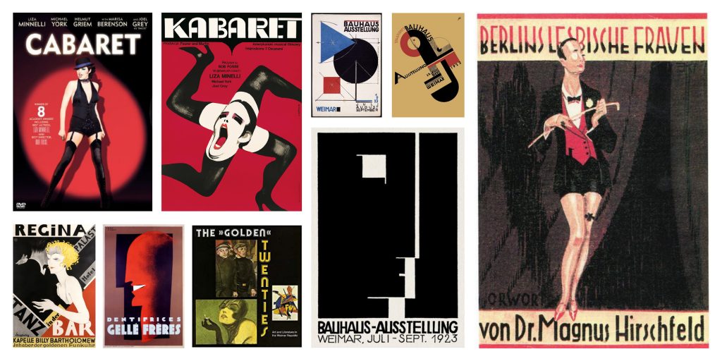
From a design point of view, Germany’s Weimar era (the interwar period between Germany’s defeat in World War I in 1918 and Hitler’s rise to power in 1933) is a rich seam of art, culture and design that continues to entrance, challenge and inspire artists and designers to this day- 100 years after it was produced.
Cabaret, set during the height and subsequent last-days of Weimar era Berlin is a musical that needs little introduction. Widely considered to be one of the greatest musicals of all time it has been adapted countless times in landmark productions since it first debuted in 1966 and the film version released six years later in 1972 remains one of the most successful translations of a musical stage production to film. So when the aka studio had the opportunity to explore the brief for a new reinvention of Cabaret we couldn’t wait to sink our teeth into the project.
The success of both the stage and film versions of Cabaret, not to mention the popularity of Weimar styled art and design provides unique challenges when creating the creative key-art for a new show, especially one of the most creatively ambitious productions the musical has seen, reinventing and redefining the classic for a new contemporary audience.
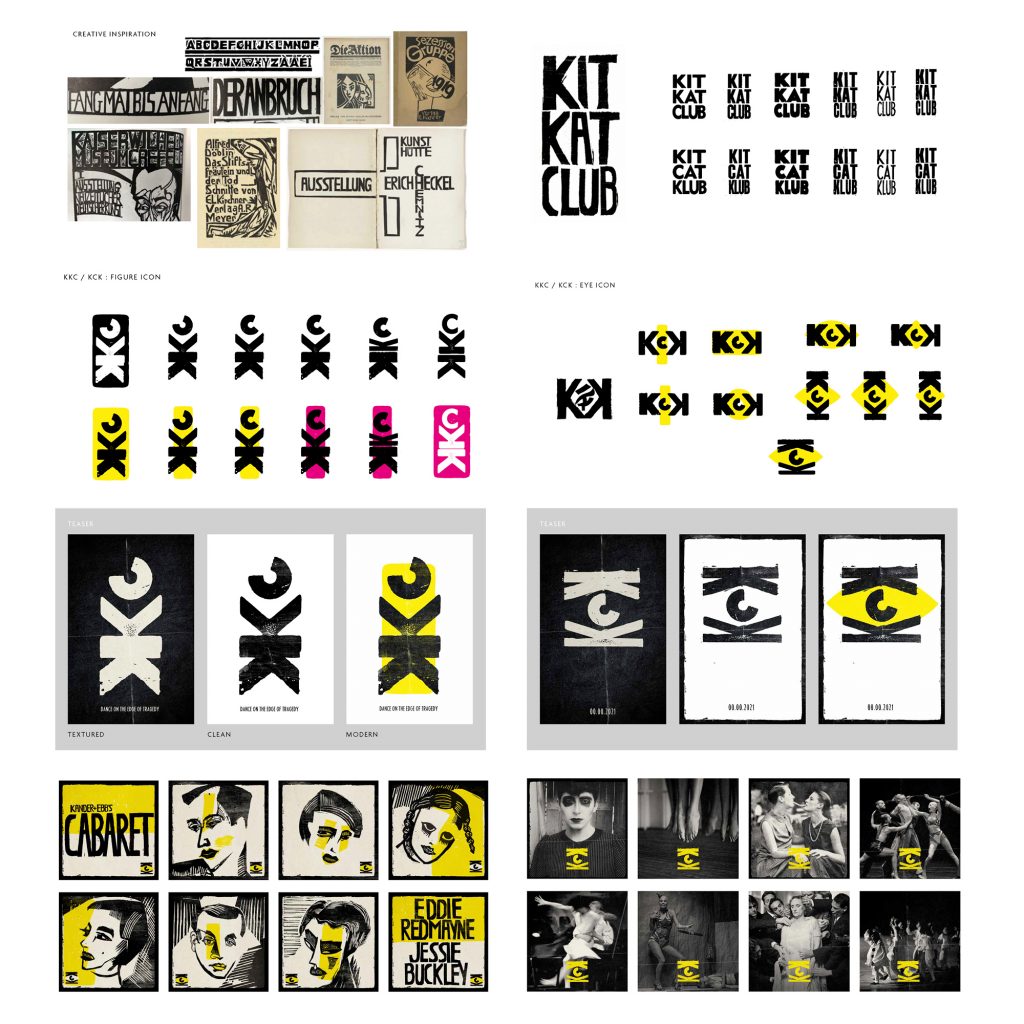
One of the many interesting aspects of this new production of Cabaret was the creation of the Kit Kat Klub as a destination in and of itself. In doing this the production team completely redesigned the interior of the Playhouse Theatre, giving it a makeover that marries Weimar decadence with a post-punk new-romantic sensibility so that when you step inside the theatre you’re transported into a world where you feel you can truly “Leave your troubles outside”.
And so, in transforming the former Playhouse Theatre into the Kit Kat Klub of the production, this meant that not only were we creating a brand for the show but we were also creating a brand identity for the club itself.
The design and branding of the Kit Kat Club presented a unique opportunity, one where we could contrast typography and iconography influenced by the Weimar era, particularly expressionist woodcut prints (such as those produced by Otto Dix) with a more refined and modern title treatment for the show title and in so doing, bring the past into the present. It became apparent as the project progressed that this production was not just about looking back and reliving past glories but rather one that would use the past as a prism to view the present and the show branding design was a great way to reflect this.
The logo for the Kit Kat Club developed from a woodblock styled print lockup to an abstract dancing figure comprised of the clubs initials and eventually became a peeping eye suggestive of the voyeuristic nature of both the Kit Kat Club and the wider world the story of Cabaret inhabits.
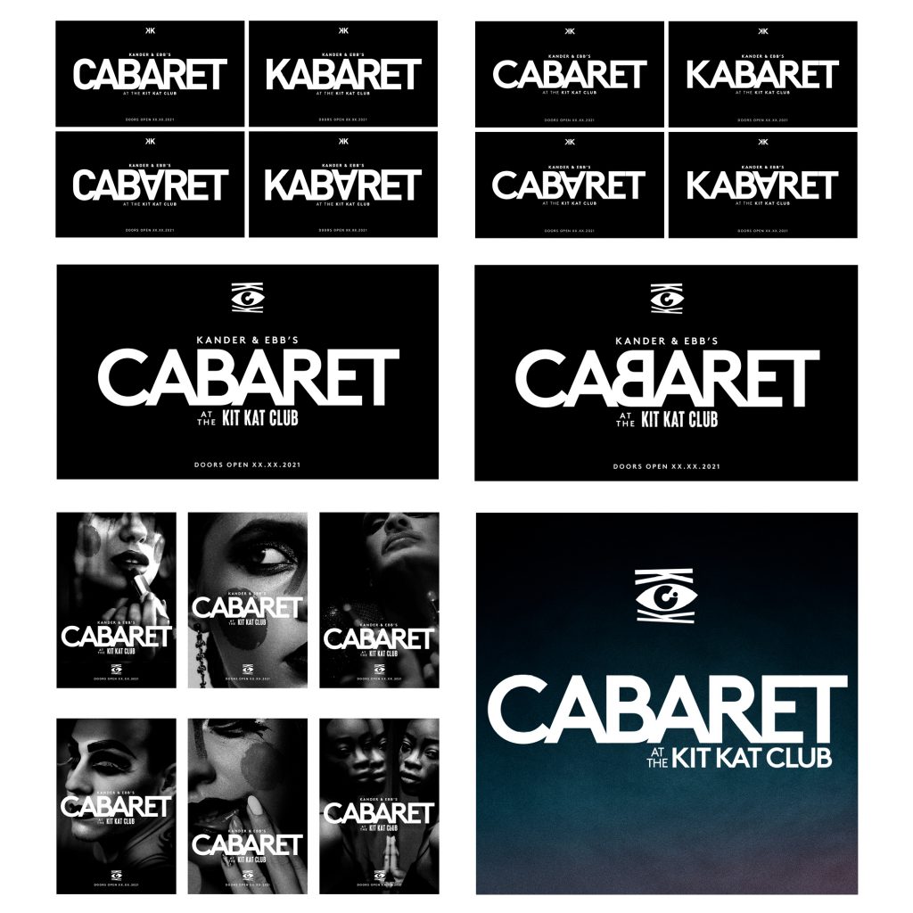
Once the branding for the club and venue was established we could then develop how this would work alongside the wider brand for the show itself, utilising the Kit Kat Club logo as an anchor for the overall show brand. We explored numerous different options with slight variations thinking about how reversing or upending letters could convey the transgressive nature of the show. In the end we developed a logo that was simple, modern and elegant, subtly nodding to previous iterations such as the landmark Liza Minelli film poster title treatment but confident in its ability to firmly situate the production in the present.
By Damien Frost, Art Director